Design and production of commanding icons for Microsoft 365 apps
In my role as lead designer, I approved icon designs for production and ensured quality and consistency in the design details.
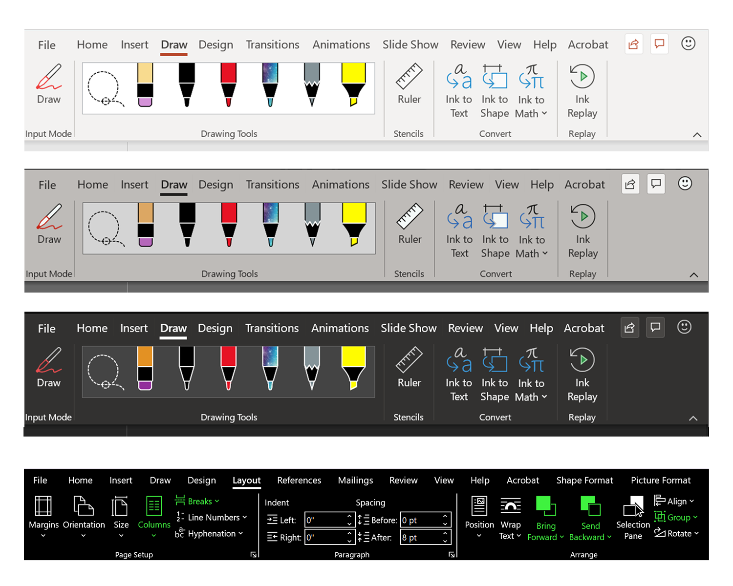
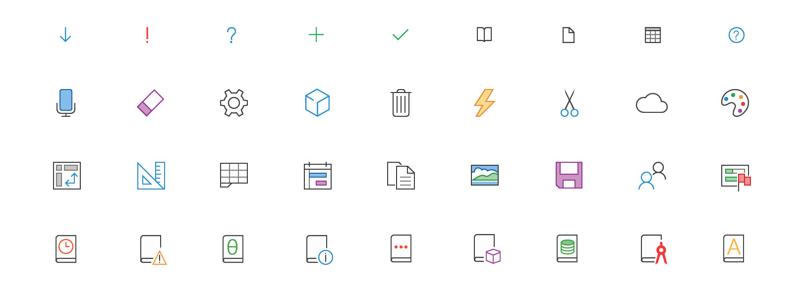
The mission of the project was to refresh all existing commanding icons to a simplified, modern style (monoline). We followed in-depth guidelines, and aligned to a system of commonly used elements. Final designs were converted into font files. Once consumed, a single assets had the ability to support multiple states and themes. A variety of accessibility concerns were considered in the design and capabilities of the icons.
As lead I provided guidance to production designers, advocated for consistency in both design concept and development, and made updates to our style guide to keep everyone on the same page. I oversaw icons added for new features by advising app teams on our established concepts and how to best align.

Pixel perfection
To accommodate variety in screen resolutions, all icons were designed with a ramp of sizes. Each size was adjusted to align to the pixel grid to ensure optimal clarity.

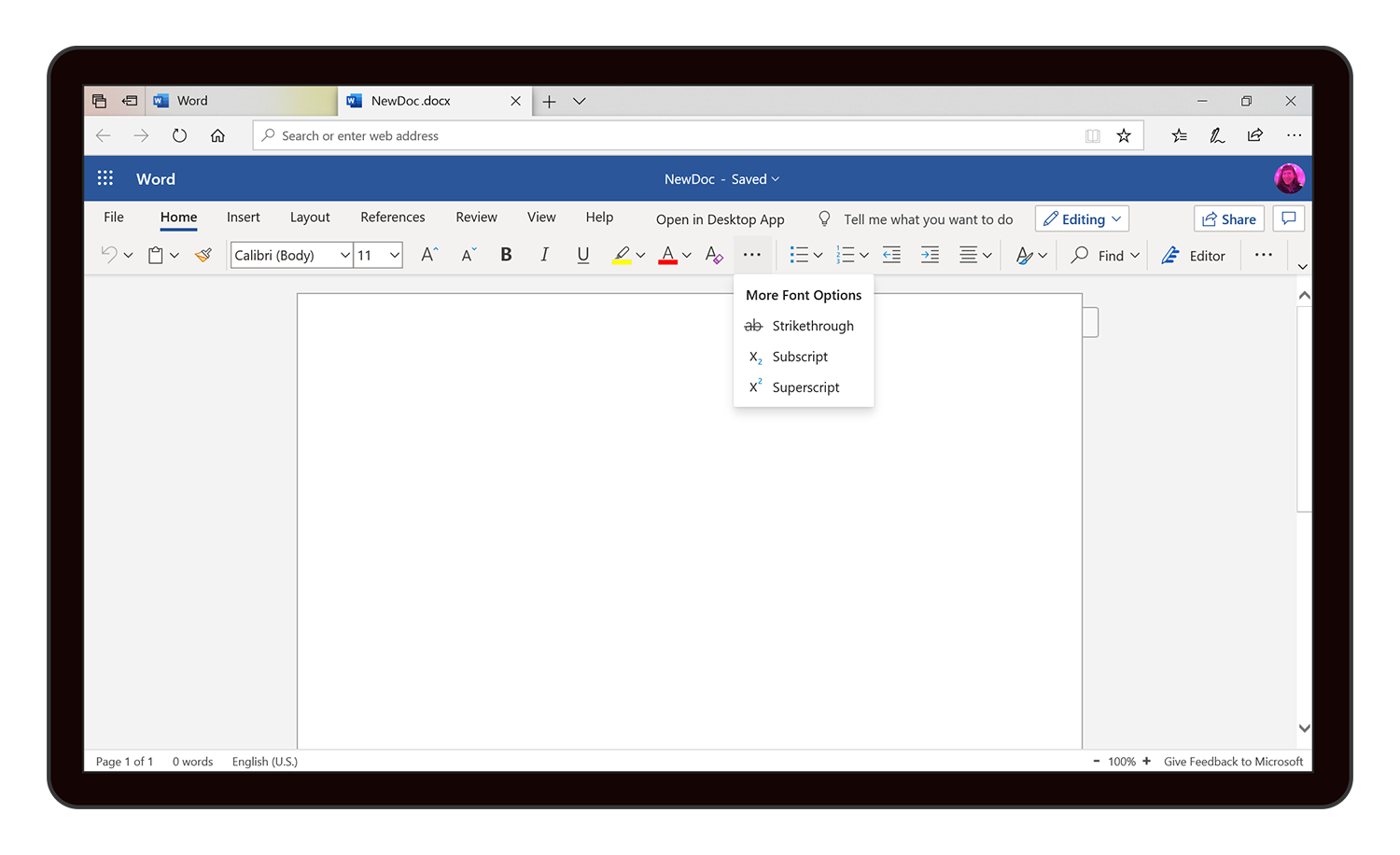
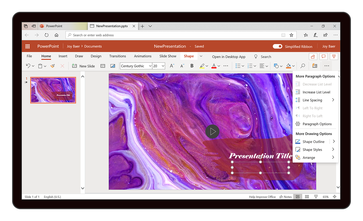
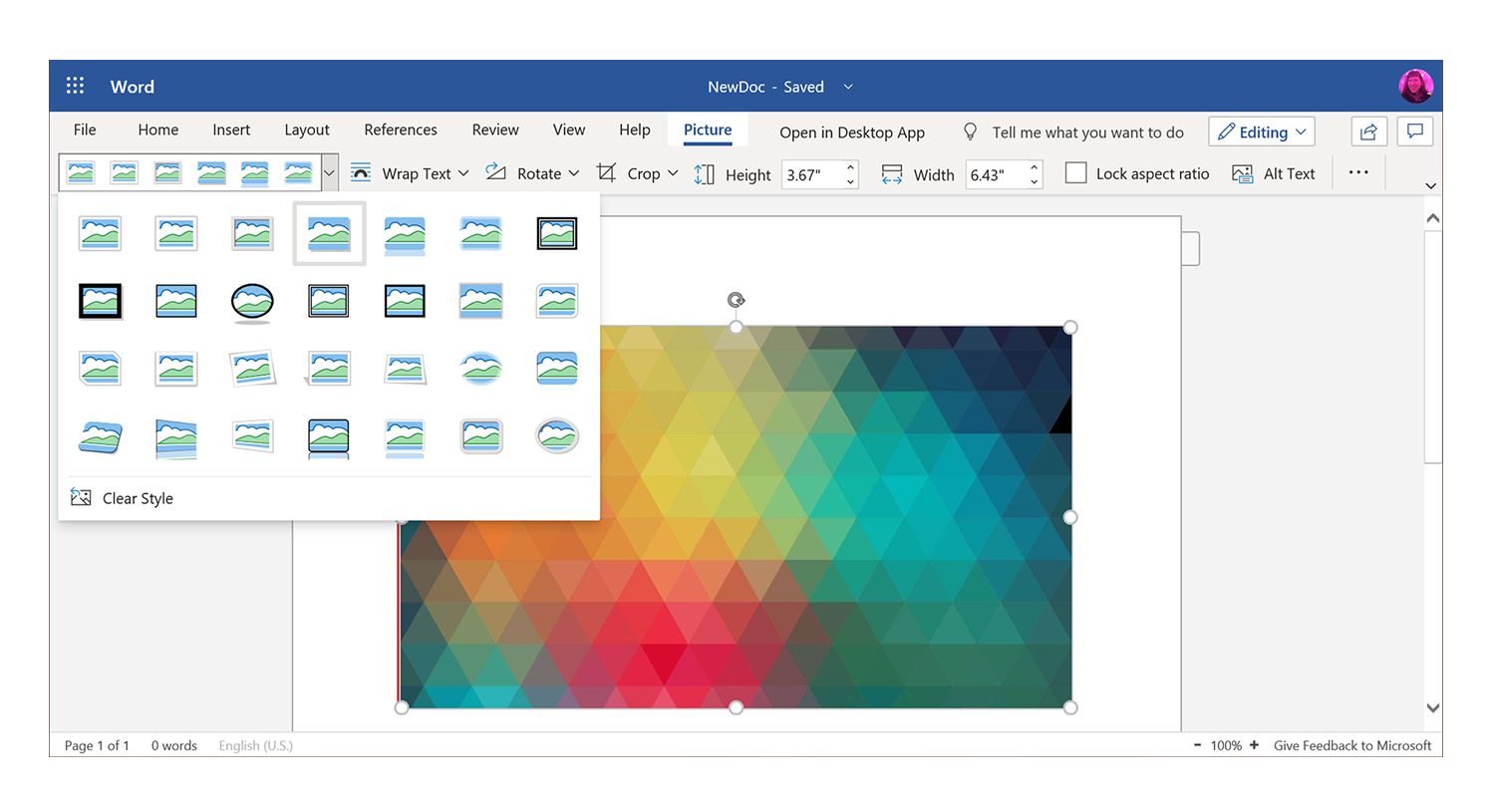
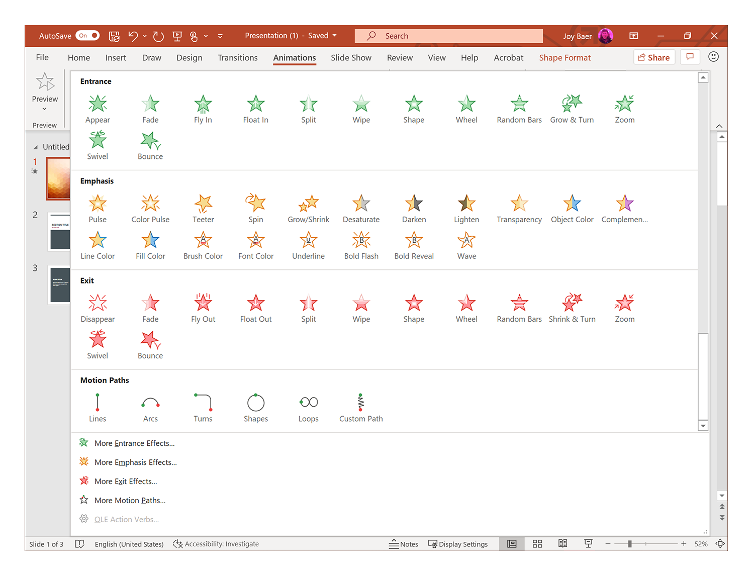
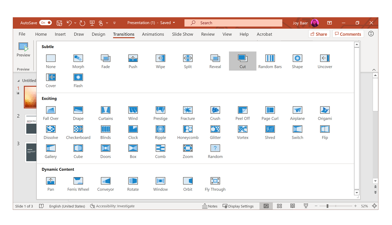
Galleries and sets
These subsets feature concept customization while maintaining alignment to the general guidelines.

Accessibility and themes
Accessibility accommodations played a big role in the design updates for Microsoft 365. Multiple states were imbedded into each icon and include White, Dark and Black modes, as well as a high contrast mode for low vision users. Color combinations in each mode were tested to ensure they met the standard for optimal contrast ratios. Single color design solutions for high contrast mode, in some cases, required additional creative thinking to convey a complex concept and differentiate icons within sets featuring similar shapes and shades.